Role: UI, UX Writing, Workflow, Testing
Objective
To find the best way for the landing page to communicate with users, present the product clearly and concisely, and create a distinctive visual identity for the page.
Stages
The design process was divided into two parts:
- How the platform would communicate with the consumer.
- Understanding the target audience;
- Defining a tone of voice for the product/brand;
- Creating the texts;
- Testing (cloze, highlighting);
- How we would present the information on the landing page.
- Low-fidelity prototype;
- Creating a design system;
- High-fidelity prototype;
- Testing;
- Hand-off.
Target Audience
For a better understanding of the needs, experiences, behaviors, and goals of the users, and to illustrate the target audience, I created two types of personas. The content will be created taking these examples into consideration.

Tone of Voice
We developed the tone of voice that the brand would use to communicate with the consumer through the platform, ensuring that the consumer could connect with the brand’s persona, Graziela. We specifically focused on traits that are already prevalent in her social media presence, ensuring a seamless continuation of the work she already does as an influencer.

Testing
To confirm that the texts were aligned with the target audience and easily comprehensible, I conducted two different tests: the cloze test and the highlighting test.
The cloze test is an educational technique often used with elementary school students, where they need to fill in a blank with the appropriate word. The goal of this test was to confirm whether the words we had chosen to explain the platform and its functioning made sense to the users.
Another test employed was the highlighting test. Participants were instructed to mark in green anything they found important and in red if something caused confusion. The objective of this test was to corroborate the written texts in conjunction with the results obtained from the cloze test.
Both tests were carried out with the active customer base (39 clients), with participants voluntarily responding to the survey. In total, we received 11 responses for the cloze test and 14 for the highlighting test.
(The original survey was conducted in Portuguese).


We reworded some of the texts based on the feedback we received from the highlighting test. We noticed that there was a lot of text and that it could be condensed to make the user’s reading and comprehension smoother and easier.
Low-Fidelity Prototype
This is the final version of the low-fidelity prototype developed based on market research and various ideas that emerged during meetings. We managed to incorporate all the necessary sections to ensure that users navigate efficiently and sequentially, grasping how the product works in a simple and concise manner.

To access the complete low-fidelity prototype, click here.
Design System
Following the finalization of the low-fidelity prototype, I created a basic design system using the existing brand settings and adapting font styles and sizes.

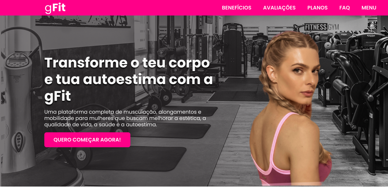
High-Fidelity Prototype
The final result of the project turned out as follows:

To access the complete high-fidelity prototype, click here.
Testing
The tests were conducted online with 8 users.
Intuition Test: The initial test involved asking users to access the prototype link and interact with the page. The objective was to determine if users could understand the page without much explanation.
Results: Users understood the flow and were able to interact with the buttons until reaching the product purchase page. Key elements such as titles and CTAs (Call to Action) were easily found.
Message Clarity Test: In this phase, I tested all the content created for the landing page. The goal was for users to feel confident in purchasing the service and to identify any missing information.
Results: Users grasped the purpose of the page but had some questions about payment methods and cancellation. These concerns were addressed in the FAQ section.
User Feedback Test: To conclude the user tests, after the navigation, I requested feedback on the overall experience, encountered issues, and possible improvements.
Results: Some users wanted more product reviews and a way to view the content of each plan more comprehensively.
The results from all user tests were taken into consideration, and adjustments were made to the prototype, which was then shared with the development team for coding.
After the landing page was delivered, we tested its responsiveness on different devices and its loading time.
Result
You can find the final result by clicking here: https://treinadorabel.com.br/gfit/